01 — Overall Strategy
Clinical Recruitment
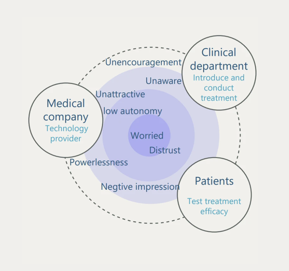
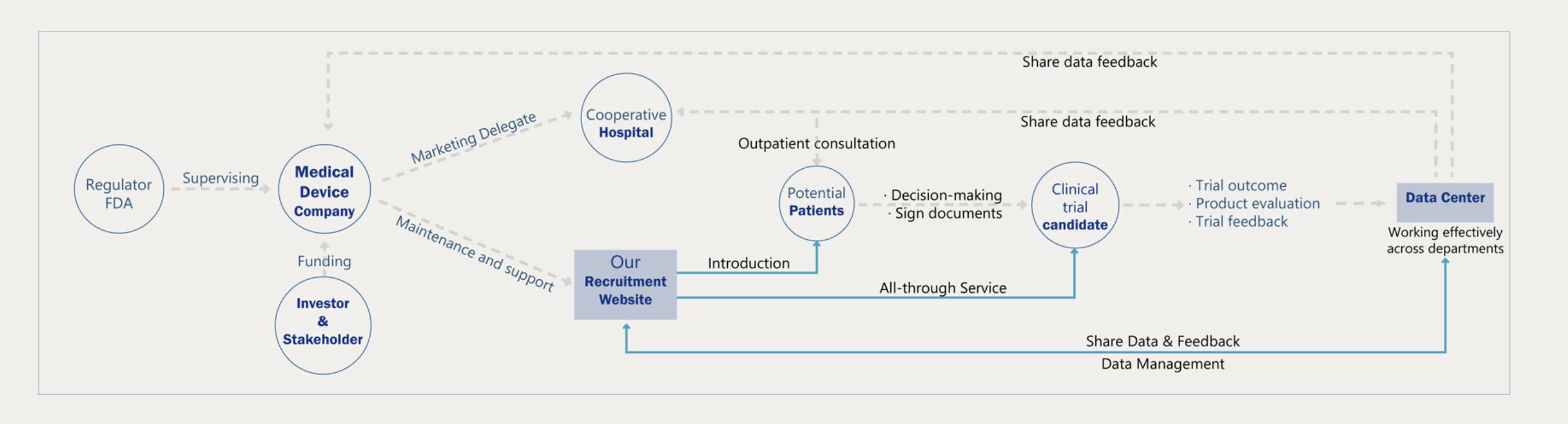
Ecosystem
Most clinical trial websites are built for crisis patients—people with no options left.
But treatment-resistant hypertension patients aren't in crisis. They're managing.
How do you recruit someone who isn't desperate?
This project redesigns the entire recruitment journey around one thesis:
trust is the product.
02 — What did I do?
Role
UX Research · Strategy
Interaction Design
Wireframing · Hi-fi Mockups
Collaborators
Clinic physicians
Product Team
12+ clinical stakeholders
Scope
Patient portal
Eligibility flow
Post-procedure system
03 — The Problem
Three parties, three deadlines, zero alignment
Company — fixed patient quota by a hard deadline.
Physicians — 8 minutes per clinic slot to introduce the procedure.
Patients — no immediate threat, no urgency to decide.
Existing sites — built for crisis patients; language reads as alarming to non-crisis users.
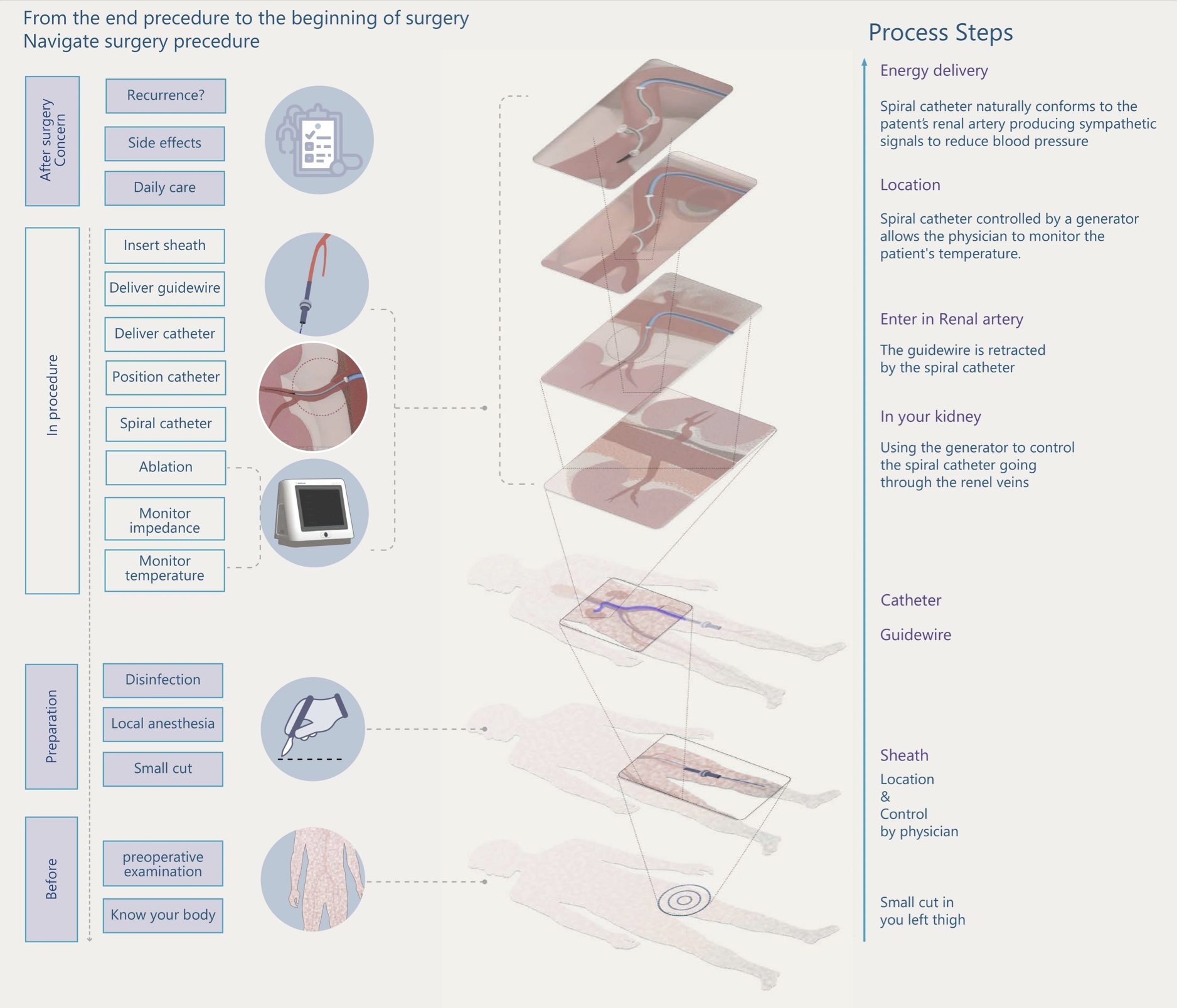
Before — Awareness
Medical knowledge anxiety
Clinical terminology with no accessible translation. Patients' response was avoidance, not engagement.
During — Enrollment
Consent document distrust
A 14-page form front-loaded with risks triggered the exact anxiety the site was meant to defuse. Drop-off spiked here.
After — Follow-up
Post-procedure abandonment
Recruitment ended at sign-up. No structured guidance for diet, monitoring, or follow-ups. Uncertainty bred regret.
04 — Research & Insights
The trust gap is measurable
Survey across 200+ patients showed a 30-point gap between in-person specialist communication and digital ads. The digital portal wasn't just less trusted—it was actively distrusted.
"A portal that carries a specialist's clarity—not a consent form's anxiety—can inherit the trust a clinic visit already built."
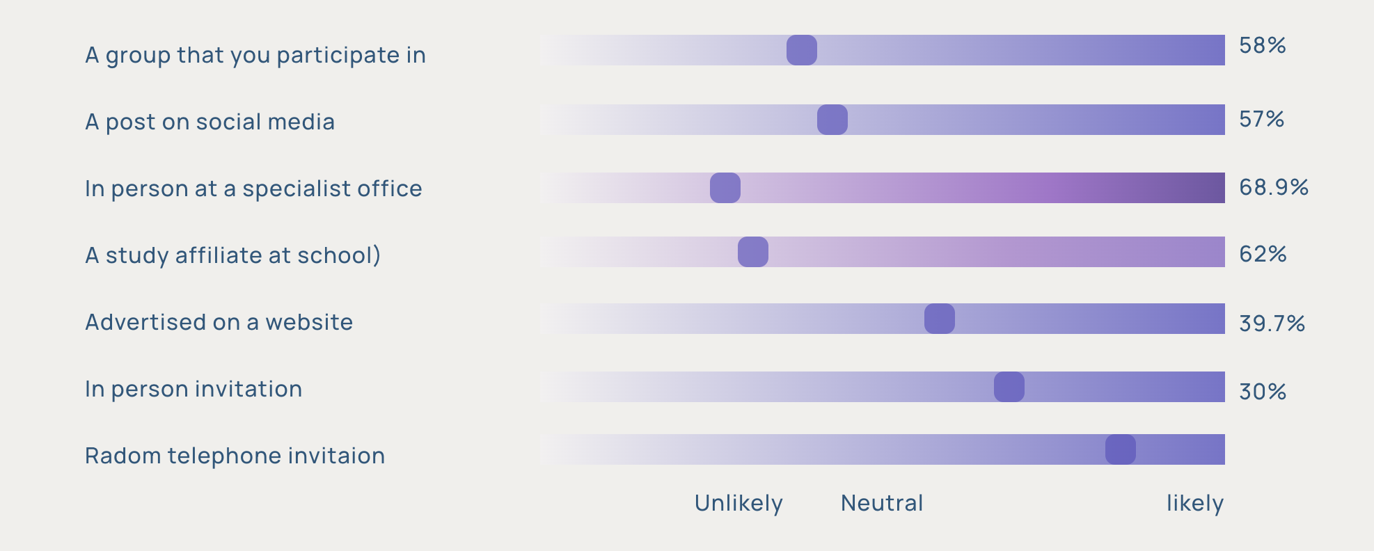
68.9%
trust information from specialist in clinic
~39%
trust digital ads for medical decisions
30pt
trust gap the portal needed to close
8 min
avg physician window to introduce trial
05 — Design Decisions
Research Finding — Before
68.9% trust specialist communication. 0% of existing sites replicate this. Medical terminology without translation creates cognitive load that reads as threat.
Design Response ✓
Layered disclosure: plain language first, clinical detail on demand—three tiers per page. Visual metaphors carry meaning the words can't.
Rejected alternative: standalone glossary page. Users don't navigate to reference pages—they need inline answers.
Research Finding — During
The 14-page consent form was the highest drop-off point. The problem wasn't the length—it was the sequence. Risks before context.
Design Response — Qualified Friction ✓
Counter-intuitive: I didn't simplify the flow—I reordered it. Benefits and evidence before risks. Branching eligibility screener that mirrors the specialist's checklist, so patients feel vetted, not trapped.
Trade-off: ~15% lower raw sign-up volume. Candidate quality improved—higher proportion passed clinical pre-screening.
Research Finding — After
7/10 patients said their biggest worry wasn't the surgery—it was "what my life looks like afterwards." Post-procedure anxiety was a pre-enrollment blocker.
Design Response ✓
Made the after-surgery hub publicly visible before sign-up. 90-day lifestyle guide, coordinator contact, follow-up schedule—all accessible to unenrolled patients. Showing what happens next converted the unknown from threat to expectation.
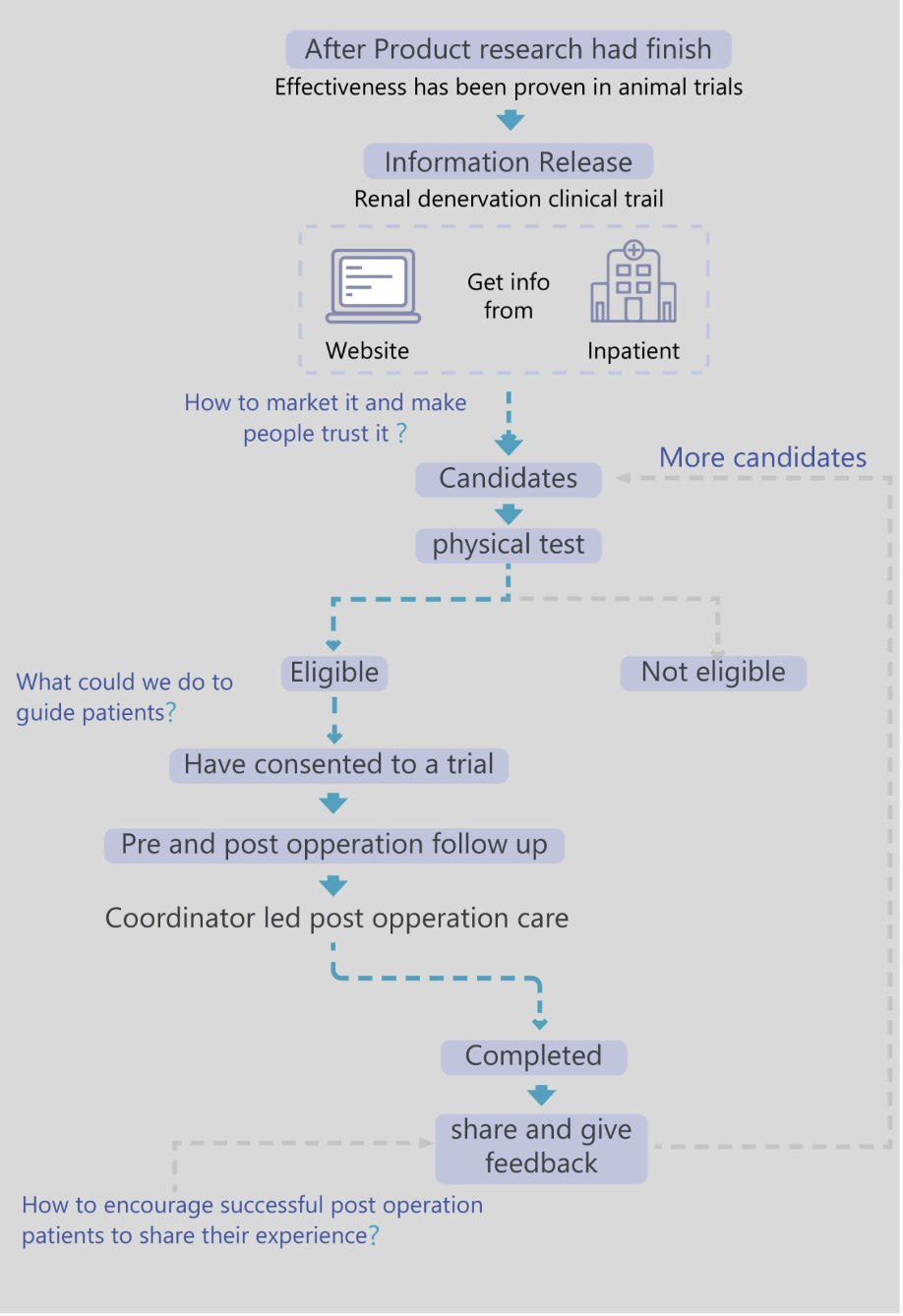
06 — End-to-End Journey
Three questions, three design decisions.
Mapping the recruitment ecosystem surfaced three strategic gaps, each tied to a specific phase of the patient journey. These weren't picked from a checklist—they came from where the journey actually broke down. Each became one of the design decisions in the previous section.
-
Question 01 · Awareness
"How do we market it and make people trust it?"
→ Layered disclosure (Decision 1)
-
Question 02 · Enrollment
"What could we do to guide patients?"
→ Branching eligibility screener & qualified friction (Decision 2)
-
Question 03 · Post-procedure
"How do we encourage patients to share their experience?"
→ After-surgery hub visible before sign-up (Decision 3)
Awareness
Pain
Medical language reads as alarming. Patient disengages before reading.
Response
6-entry homepage by patient question, not company structure.
Education
Pain
30pt trust gap vs specialist conversation.
Response
Layered disclosure: visual → plain → clinical. Mimics specialist consultation sequence.
Enrollment
Pain
Consent form drop-off. Risks before context.
Response
Branching screener. Benefits before risks. Qualified friction.
Post-Procedure
Pain
"What's my life like after?" blocks pre-enrollment decision.
Response
After-surgery hub visible before sign-up.
07 — Validation & Hypotheses
This portal is a working prototype, not a deployed product. So I want to be precise about what's established and what's still to be tested—because in clinical contexts, the difference matters.
Established · Evidence base
30pt
Trust gap to close
Measured across 200+ patients in primary research—the gap between specialist trust (68.9%) and digital-channel trust (~39%).
−26.4
mmHg at 36 months
Clinical efficacy data from peer-reviewed renal denervation trials—surfaced inside the portal to give patients real evidence to weigh.
8 min
Physician window
The constraint observed in clinic. The portal exists to extend the conversation past the 8-minute slot, not replace it.
Hypotheses · To be validated post-deployment
Qualified friction improves candidate quality
The branching screener is expected to lower raw sign-up volume in exchange for higher pre-screening pass rates. Worth testing because clinical pre-screening time is the scarcer resource, not portal traffic.
Honesty disclosure outperforms reassurance
Publishing the "10–20% non-responder" figure was the most contested internal call. The hypothesis: in high-stakes medical contexts, candour earns trust faster than optimism. To be measured against drop-off at the disclosure screen.
The shift from Outcomes to Validation & Hypotheses is itself the point: this work is grounded in measured research and articulated bets, not in claimed metrics from a project that hasn't shipped.
08 — Reflection
What worked
"Qualified friction" sounds counter-intuitive. Why would you make sign-up harder? But the trade-off held up: lower raw volume in exchange for a candidate pool that mirrors what the clinic actually needs. This was the first time I felt clearly that design isn't about optimising every metric. It's about optimising the right one. A low-quality sign-up costs a physician thirty minutes of pre-screening; portal traffic is cheap, but their attention isn't.
What I'd change
I treated trust as something a portal could build through clearer language and better disclosure patterns. In hindsight, the real trust lives outside the portal: in the physician's eight-minute conversation, in what patients tell each other in waiting rooms and group chats. The portal can amplify that trust, or break it. It isn't the source. If I were starting again, I'd map how trust flows through a patient's network before deciding what the portal should carry.
09 — Live Prototype
Where the research becomes a product.
Every design decision in the previous sections—layered disclosure, the eligibility self-check, the dual timeline, the honesty principle—is concretised here. This isn't a static mockup; it's a working patient-facing portal you can navigate, test, and break.
Interactive iframe · Final vision have copyright belong to microport company · Part of the content shown here